
Summary
Check out the demo to see the final result.In general, we coded a 2-column layout on desktop that breaks into a 1-column layout on smaller screens. The 2 column-layout has a "right lane" where images are faded into one another by scrolling.
This tutorial is designed for you to follow along with the demo repository.
Architecture
This project uses the following architecture:- Next.js as React Framework
- Tailwind as CSS Framework
- react-scrollmagic as animation library
- Typescript instead of Javascript
Tip: You may be able to swap one dependency for another. For example, on my personal website I implemented the landing page without Tailwind. In case you're stuck, raise an issue at the repository of this article.
Looking at the config and dependencies
package.json
The file can be found here.After cloning the repository, run
1npm installtailwind.config.js
The file can be found here.Don't forget to include the following segments:
purgeshould contain the path to yourcomponentandpagesfolder, and every other path you may use Tailwind class names in.- The
variantsblock enables the:first-childselector for theopacityproperty - something that we will need later!
1// tailwind.config.js
2
3module.exports = {
4  // other config
5  purge: ['./pages/**/*.{js,ts,jsx,tsx}', './components/**/*.{js,ts,jsx,tsx}'],
6  variants: {
7    extend: {
8      opacity: ['first'],
9    },
10  },
11}
postcss.config.js
The file can be found here.Without its content, Next.js will not be able to pick up your Tailwind class names!
styles/main.css
The file can be found here.For using Tailwind, the following imports are mandatory:
1/* styles/main.css */
2
3@tailwind base;
4@tailwind components;
5@tailwind utilities;_app.tsx:1// pages/_app.tsx
2
3import '../styles/main.css';pages/_document.tsx
The file can be found here.Important about it is the inclusion of jQuery and a custom jQuery plugin: Because of the custom plugin, we are not using the
jquery npm package, but rather the script import, which can be found here. The custom plugin we are gonna need later can be found here.1// pages/_document.tsx
2
3class MyDocument extends Document {
4 render() {
5 return (
6 <Html lang="en">
7 <Head>
8 <script defer src="/scripts/jQuery.min.js" />
9 <script defer src="/scripts/jQuery.inViewport.js" />
10 </Head>
11 // body etc.
12 </Html>
13 );
14 }
15}Information: Our custom jQuery plugin exposes a new function called
Example: When a element is completely inside the viewport, the function will return 1 (100%). When a element is half inside the viewport (measuring from the bottom of the screen), the function will return 0.5 (50%). And so on...
percentAboveBottom. This function tells us, how many percent a jQuery element is above the bottom of the viewport. Example: When a element is completely inside the viewport, the function will return 1 (100%). When a element is half inside the viewport (measuring from the bottom of the screen), the function will return 0.5 (50%). And so on...
Tip: For type support of our jQuery plugin function
percentAboveBottom, add this file to your project.Describing the data
When we look at our demo, we can see that one section consists of the following areas:This is why we're describing each section of our landing page using that same, intuitive approach. The data file can be found here. The following code snippet declaratively describes the first "index section". Our demo has 3 index sections, you can add as many as you want though!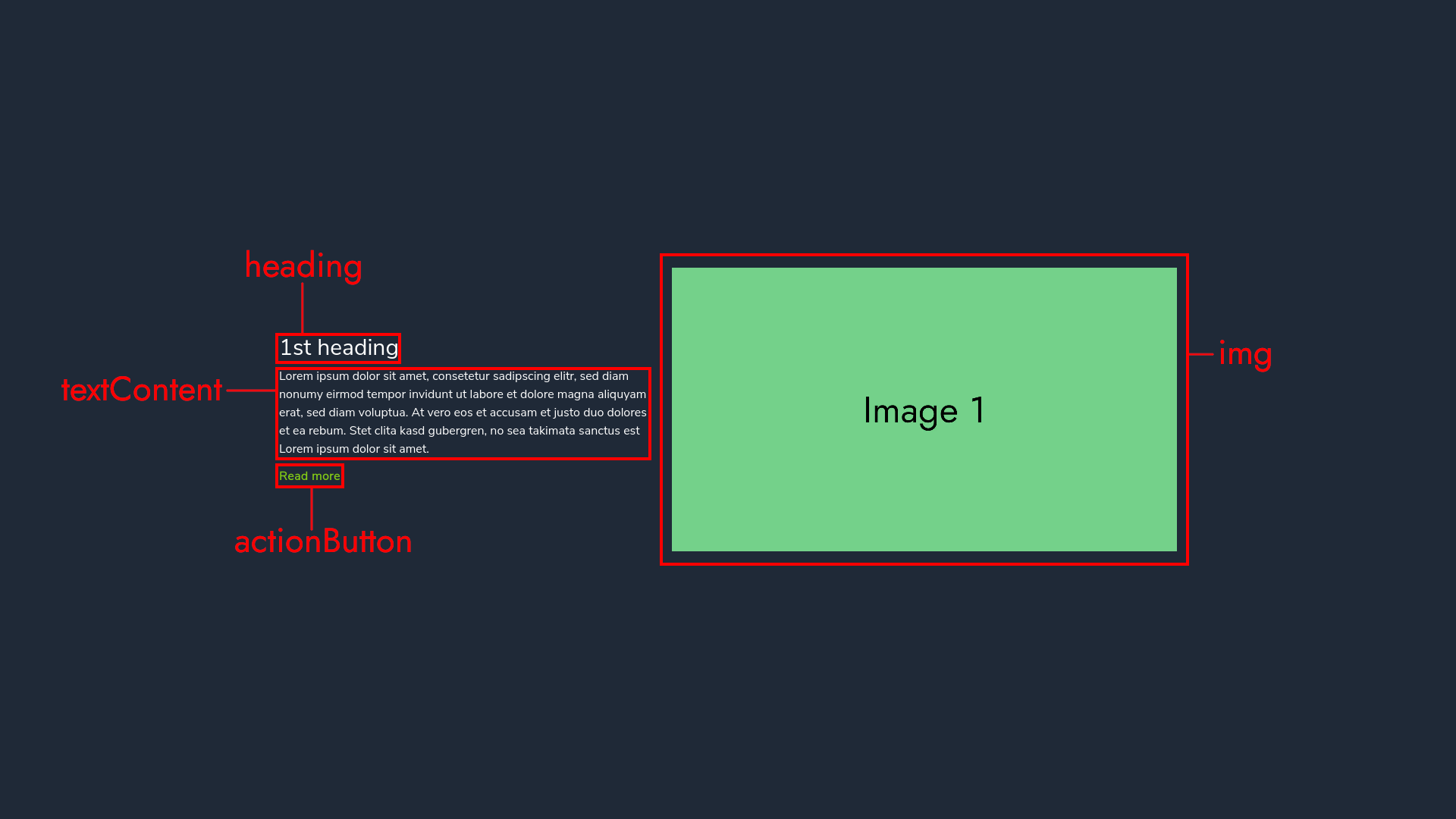
1// data/indexSections.tsx
2
3export interface IIndexSection {
4  actionButton: ReactNode;
5  heading: string;
6  img: ImageProps;
7  tag?: keyof HTMLElementTagNameMap;
8  textContent: ReactNode;
9}
10
11const getIndexSections = (): IIndexSection[] => {
12  return [
13    {
14      heading: '1st heading',
15      img: {
16        src: '/img/1.png', // public/img/1.png is the path
17        alt: 'This is the first image',
18        priority: true,
19      },
20      textContent: (
21        <>
22          Lorem ipsum dolor sit amet, consetetur sadipscing elitr, sed diam
23          nonumy eirmod tempor invidunt ut labore et dolore magna aliquyam erat,
24          sed diam voluptua. At vero eos et accusam et justo duo dolores et ea
25          rebum. Stet clita kasd gubergren, no sea takimata sanctus est Lorem
26          ipsum dolor sit amet.
27        </>
28      ),
29      actionButton: <NextLink href="#">Read more</NextLink>,
30      tag: 'main',
31    },
32    ...
33  ];
34};
Important: Because of the nature of our implementation, all images have to be 1920x1080.
You can change from 1920x1080 to your desired dimensions by altering the following variable in the converter:What remains is that all images have to have the same dimensions - when one is 1920x1080, the others have to be as well!
You can change from 1920x1080 to your desired dimensions by altering the following variable in the converter:
1// components/IndexSections/ToIndexSectionConverter.tsx
2
3const imgDimensions = {
4  width: 1920,
5  height: 1080,
6};Tip: It is recommended that you apply
tag: 'main' to the first index section. That way its wrapper receives the <main> tag. When you omit the tag in your data, the wrapper will receive the <section> tag.Looking at the layout and hooks
components/IndexSections/ToIndexSectionConverter.tsx
The file can be found here.This React component returns an array of React components. We will have to convert these later!
1// components/IndexSections/ToIndexSectionConverter.tsx
2
3const ToIndexSectionConverter = (props: IProps) => {
4  const { heading } = props;
5  return [
6    <LeftLaneItem key={heading} {...props} />,
7    <RightLaneItem key={heading} {...props} />,
8  ];
9};
components/IndexSections/IndexSections.tsx
The file can be found here.Let's go over the logic step-by-step:
useAdaptLeftLaneItemHeight: This hook ensures that the index sections behave responsive in their height. The hook returns 2 values that are important for thereact-scrollmagic<Scene>.
1// components/IndexSections/IndexSections.tsx
2
3const IndexSections = (/*...*/): JSX.Element => {
4  const container = useRef() as MutableRefObject<HTMLDivElement>;
5
6  // ...
7
8  const { leftLaneItemHeight, triggerHook } =
9    useAdaptLeftLaneItemHeight(container);
10
11  return (
12    <div className="index grid" ref={container}>
13      // ...
14        <Controller>
15          <Scene
16            duration={`${(leftLane.length - 1) * leftLaneItemHeight}`}
17            pin
18            triggerHook={triggerHook}
19          >
20            // ...
21          </Scene>
22        </Controller>
23      // ...
24    </div>
25  );
26};
useLeftAndRightLane: This hook maps over the data and converts them via theToIndexSectionConverter. It useslodash's zip function under the hood.
1// components/IndexSections/IndexSections.tsx
2
3const IndexSections = (/*...*/): JSX.Element => {
4  // ...
5
6  const [leftLane, rightLane] = useLeftAndRightLane();
7
8  // ...
9};
10
11// components/IndexSections/hooks.ts
12
13export const useLeftAndRightLane = () =>
14  useMemo(() => {
15    const pairs = getIndexSections().map(ToIndexSectionConverter);
16    return zip(...pairs); // [[left1, right1], [left2, right2]] => [[left1, left2], [right1, right2]]
17 }, []);useOpacityChangeOnScroll: Is responsible for fading the next index section in. It uses our jQuery pluginpercentAboveBottomunder the hood.
1// components/IndexSections/IndexSections.tsx
2
3const IndexSections = ({
4  leftLaneTopOffset,
5  rightLaneStartCliff,
6}: IIndexSectionProps): JSX.Element => {
7  // ...
8
9  useOpacityChangeOnScroll({ leftLaneTopOffset, rightLaneStartCliff });
10
11  // ...
12};
Tip: You may wonder what
leftLaneTopOffset and rightLaneStartCliff are there for. They are documented in the repository. In general, you can just leave their default values or play around with them until the animation meets your expectation.A final note on styles
Even though Tailwind makes stylesheets almost obsolete, for things like setting the font-family or specifying the grid layout traditional styles were needed. Hence, don't forget to include the following styles in your style:1/* styles/main.css */
2
3@tailwind base;
4@tailwind components;
5@tailwind utilities;
6
7body {
8 font-family: 'YOUR_FONT_FAMILY';
9}
10
11@screen md {
12 .index {
13 grid-template-columns: 1rem 40% 2rem 1fr 1rem;
14 grid-template-areas: ". left-lane . right-lane .";
15 }
16}